
A homepage is often the first impression visitors get of your website and you never get a second chance to make a first impression. If you are a business owner, blogger, or anyone who is selling products online, you need a well-structured and highly converting homepage Elementor is one of the most powerful page builders for WordPress. The websites designed with Elementor are both intuitive and highly customizable. This guide will tell you everything you need to know to create a high-converting homepage using Elementor.
Why the Homepage Design Matters?
Your homepage acts as the digital storefront of your website. Homepage design and content determines whether a visitor stays, visits more pages or leaves within seconds.
So it’s really important that your homepage :
- Clearly explains what your website or business offers.
- Establish trust through visuals, social proof, or branding.
- Guide users to take action—whether that’s signing up, purchasing, or exploring more
With Elementor, you can design every section to serve a purpose, optimize layout and flow, and A/B test elements for performance.
Also Read – Overview of Elementor Page Builder.
Step 1: Set a Website Goal
Before starting straightaway with the Elementor editor, define what you want to achieve from your homepage.
Is your website goal to :
- Generate leads through a form or email subscription?
- Sell products with featured items or categories?
- Build trust by showcasing testimonials, awards, or certifications?
- Drive engagement via blog posts, videos, or featured content?
Once the goal is clear, the designing will become much easier for you. For example, an eCommerce website’s homepage should highlight product categories and few promotional banners to generate interest, while a service business may focus on case studies and client testimonials to increase trust and credibility.
Step 2: Strategy to structure layout
The best part about Elementor is that the drag-and-drop interface allows you to organize content into rows (sections), columns, and widgets. This makes it really easier to make future updates in design and maintaining the website’s structure becomes much easier.
A high-converting homepage typically includes :
- Hero Section – Eye-catching heading, subheading, CTA button, and background image or video.
- Problem & Solution – Explain what pain point you solve and how.
- Features or Services – Highlight key offerings with icons or visuals.Social Proof – Testimonials, reviews, logos of clients.
- Lead Capture / CTA – A bold call-to-action to convert visitors.
- Blog or Resource Highlights – Showcase recent posts or guides.
- Footer – Include important links, contact info, and social profiles.
Every section must have some intent. Avoid filler content, the content that adds no value to website and your initial goal with the website. Each part should move the visitor closer to conversion.
Step 3: A Powerful Hero Section is the actual “HERO”
The hero section is the first thing visitors see when your website loads. In simpler words, the upper part of the website that is visible on screen when your website loads. It should grab attention and communicate your value instantly.
With Elementor, you can use a full-width section and design it to include :
Headline : Communicate your value proposition in one sentence (e.g., “Grow Your Business with Custom WordPress Design”).
Subheadline : Offer supporting context or benefits. (e.g., “More than 5K have already enjoying the great design.”)
CTA Button : Visible, direct, and action-oriented (e.g., “Start Your Free Trial”).
Visual Element : A high-quality image, animation, or background video that reinforces your message.
Use contrast to make CTAs stand out, and ensure this entire section is optimized for mobile.
Step 4 : Use Visual Hierarchy & White Space
Elementor gives full control over padding, margins, font sizes, and colors.
Use these tools to guide visitors’ attention :
- Larger fonts for headlines to emphasize importance.
- Consistent color schemes with contrasting CTA buttons.
- Whitespace between sections to create breathing room.
- Icons and dividers to visually organize content.
- Don’t overload each section. Keep messaging concise and scannable—especially for mobile users.
Step 5: Build Trust with Testimonials & Badges
People buy from those they trust. With Elementor, you can easily integrate :
- Testimonial widgets (carousel, star ratings, or quotes) with real names and photos.
- Trust badges like SSL certificates, media features, or awards.
- Client logos in a grid or slider to show credibility.
Try placing testimonials right after the features section to reinforce your claims.
Step 6: Optimize CTAs and Forms
Your CTA is where conversion happens.Elementor has beautiful and modern templates for CTA that you can use just by drag and drop.
With Elementor it becomes easy to :
- Build forms with customizable fields.
- Button placements in headers, mid-page, and bottom.
- Sticky banners or popups for time-sensitive offers.
- Adding Mailchimp to forms to create a subscriber email list.
Tips for a perfect form :
- Keep forms minimal – just name and email if possible.
- Make CTAs actionable: “Download Free Guide,” “Book a Call,” or “Shop Now.
- Repeat CTAs with different styles (button, banner, inline).
Step 7: Keep Navigation Clean
Navigation can either help users or overwhelm them.
Use Elementor’s sticky headers and menu customization to :
Highlight core pages only : Add only important pages in header. Rest you can add in footer or link inside other pages. It’s important to keep the navigation simple and intuitive.
- Add a standout CTA in the top-right corner.
- Minimize dropdowns or mega menus unless absolutely necessary.
- Simplifying navigation improves user focus and reduces bounce rate.
Step 8: Make It Mobile-Friendly
Mobile traffic accounts for more than 60% of website visits.
- Elementor includes responsive preview tools to:
- Adjust spacing, font sizes, and layouts for smaller screens.
- Hide desktop-heavy sections or reorder them.
- Ensure forms and buttons are easy to tap.
- Test your homepage on multiple devices before publishing.
Step 9: Track and Improve Performance
After launching, your job isn’t over. Use analytics tools to monitor :
- Google Analytics or MonsterInsights for traffic flow and bounce rates.
- Hotjar or Microsoft Clarity for heatmaps and user behavior.
- Elementor’s built-in Experiments for A/B testing headline, color, or button placement.
- Review reports weekly and iterate designs to improve conversion rates.
Common Mistakes to Avoid
Many Elementor users fall into these traps :
Overloading with widgets – Too many interactive elements slow down performance.
Ignoring SEO – Forgetting to add meta titles, alt text, and keywords.
Using inconsistent branding – Fonts, colors, and tone must stay aligned.
Not testing mobile – What looks great on desktop might break on mobile.
Real Examples of Elementor Homepages
Here are few perfect examples of homepages designed with WordPress & Elementor.
HelloChef.me
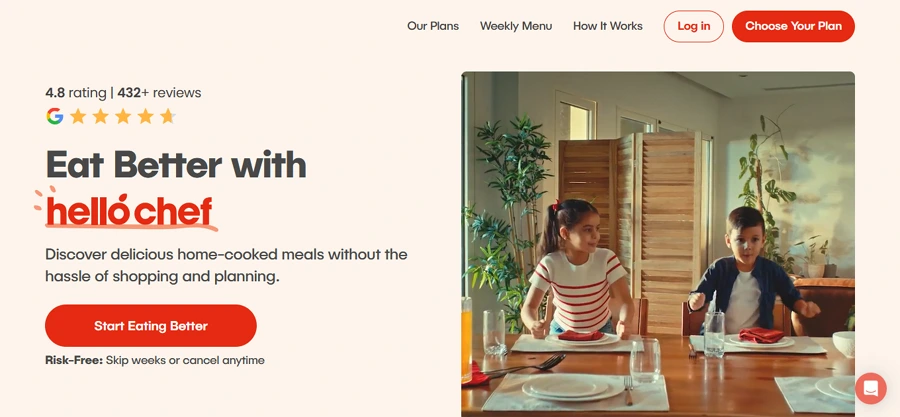
A meal kit delivery service with a strong hero message, testimonials, and clean CTAs.
WPCrafter.com
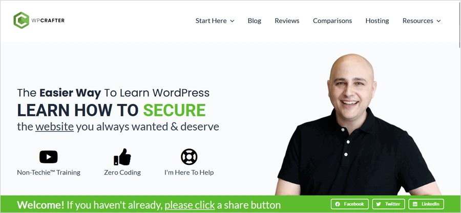
Focused on tutorials, it uses Elementor to guide users through content efficiently.
ArtandDesignDimensions.com
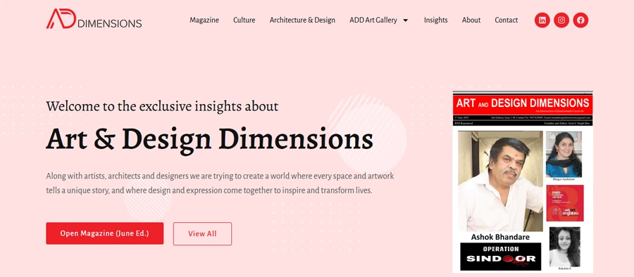
A magazine that focuses on artists and their artworks. Clean & easily accessible.
These examples demonstrate effective use of Elementor’s visual hierarchy and conversion-focused design.
Let’s Wrap Up
Your homepage is your website’s most valuable page and the real connector with your audience. With Elementor, you have the tools to create a professional, high-converting homepage without coding. Focus on clarity, trust-building, and guiding your visitor toward a single action. You would need to iterate often, test changes, and keep performance in mind. When done right, your homepage will not just look good – it’ll convert.
Good luck with designing. 🙂